KIPIC
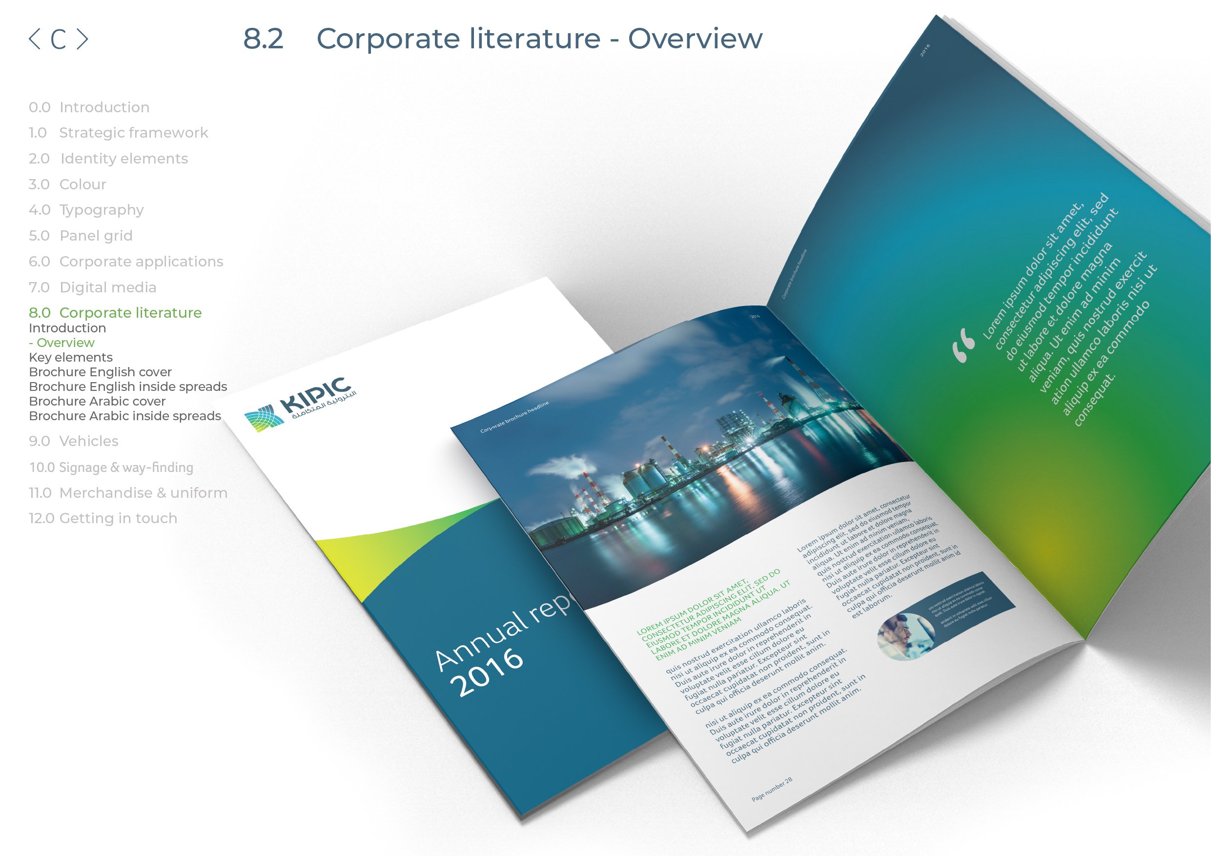
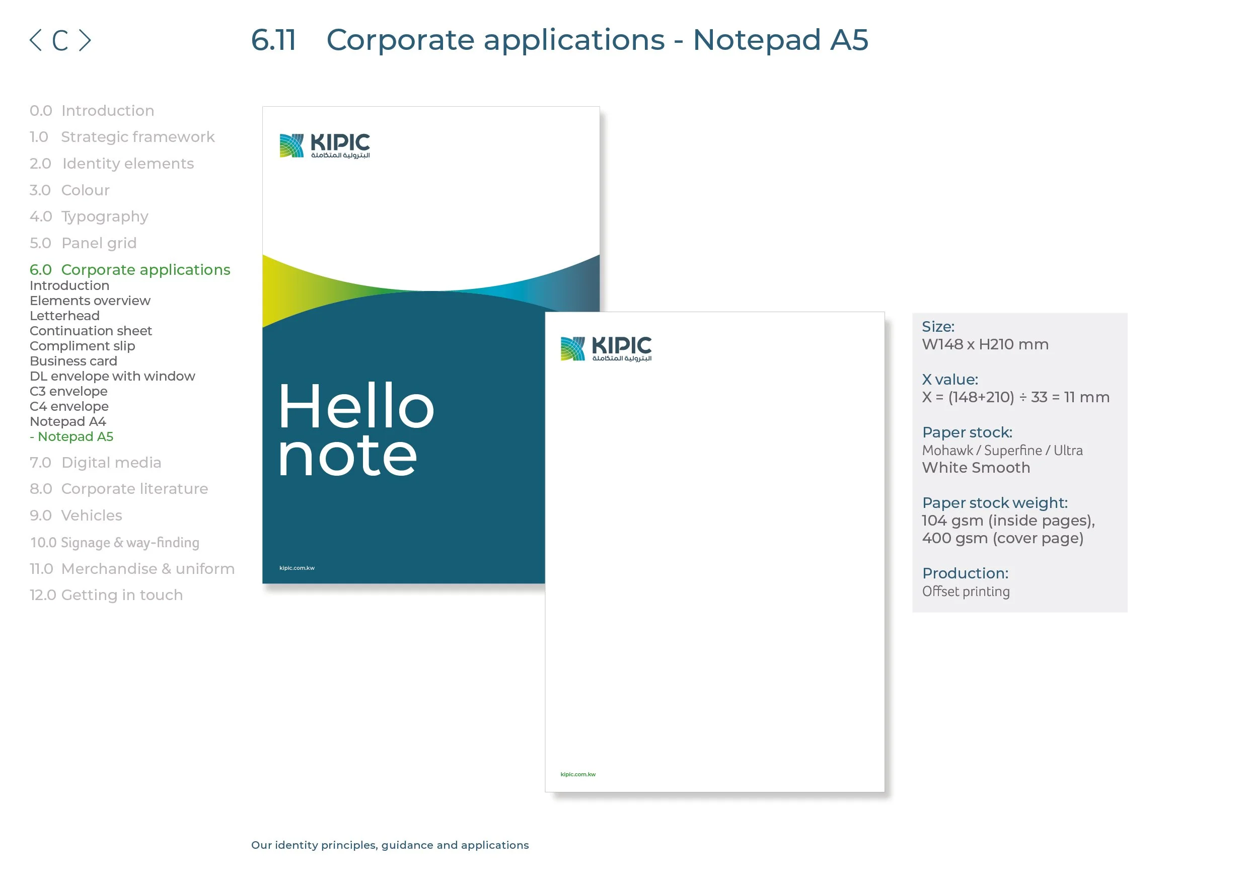
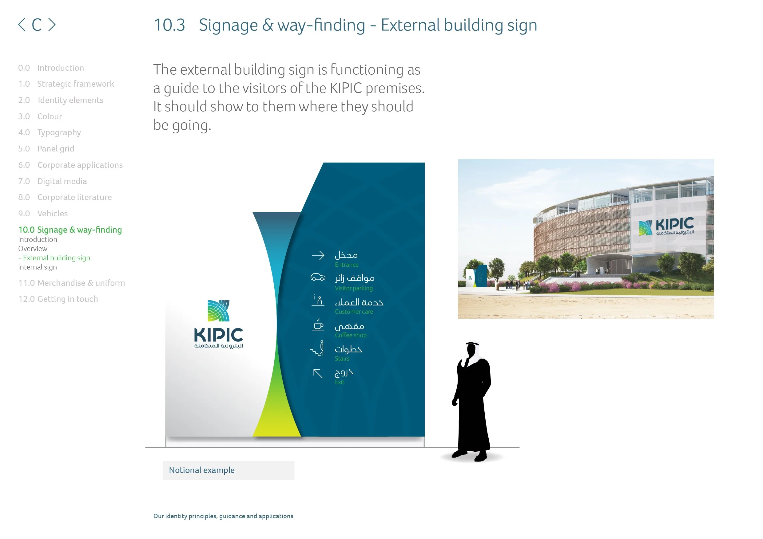
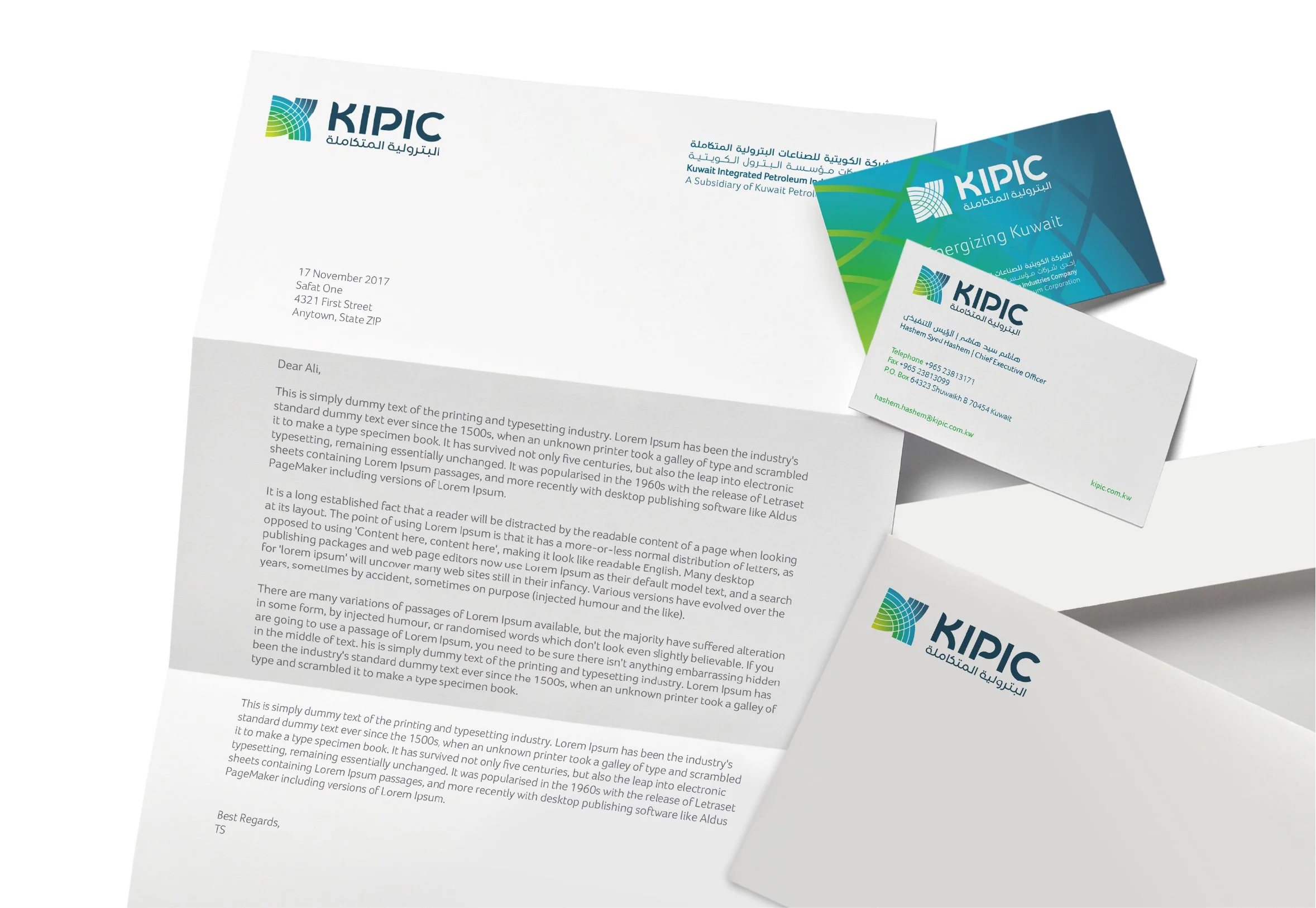
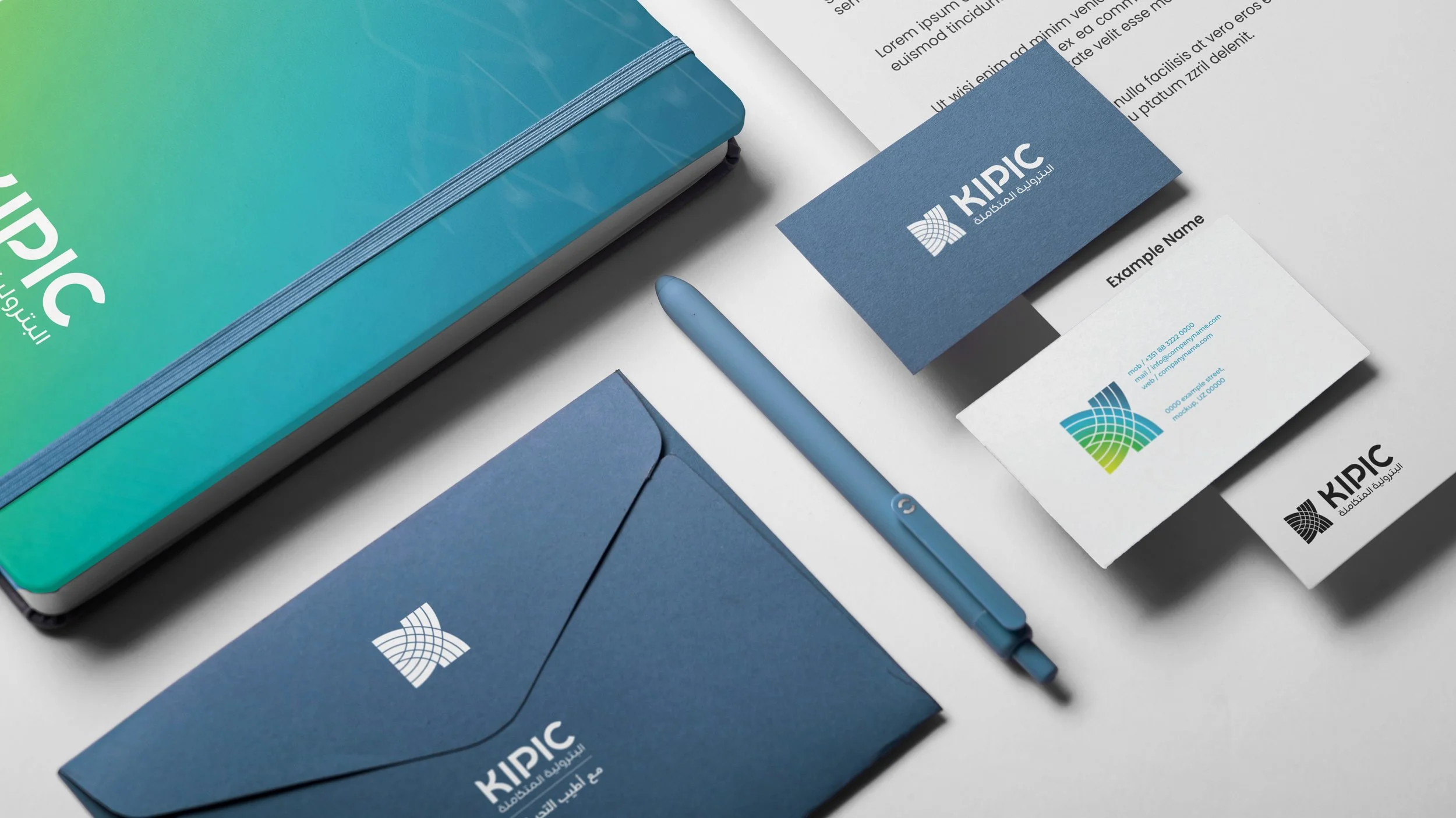
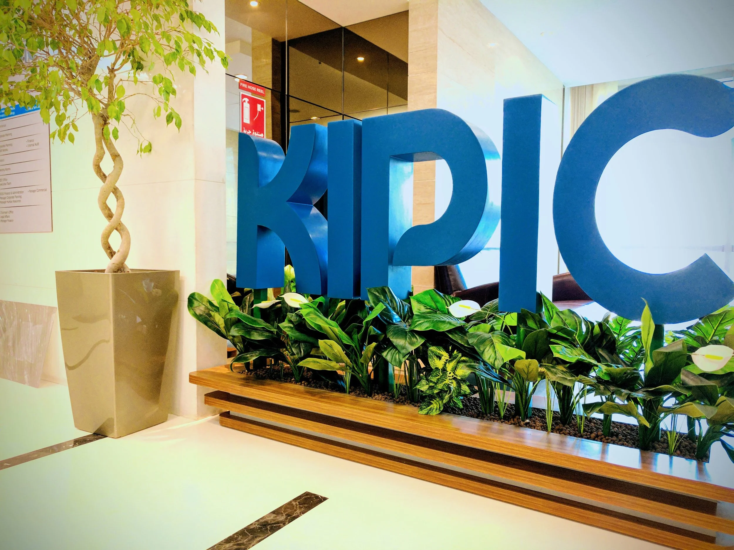
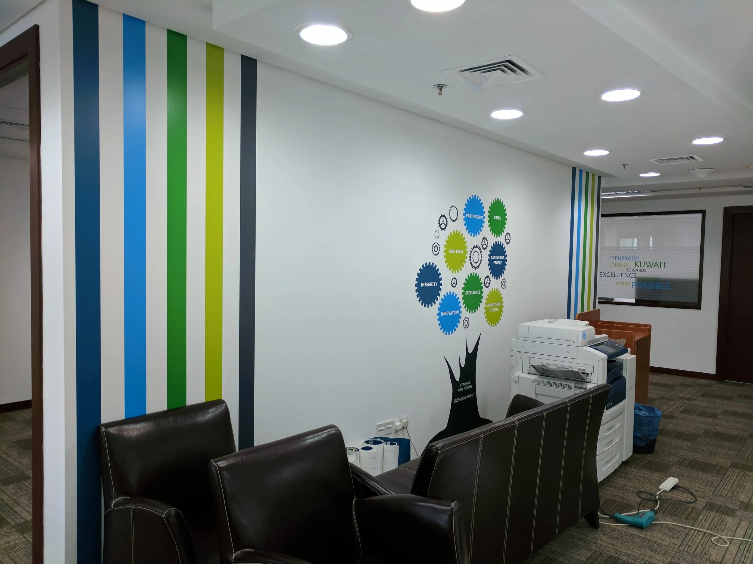
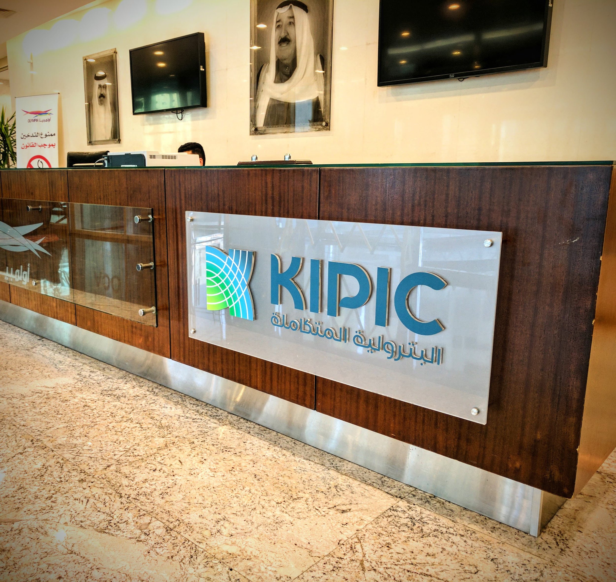
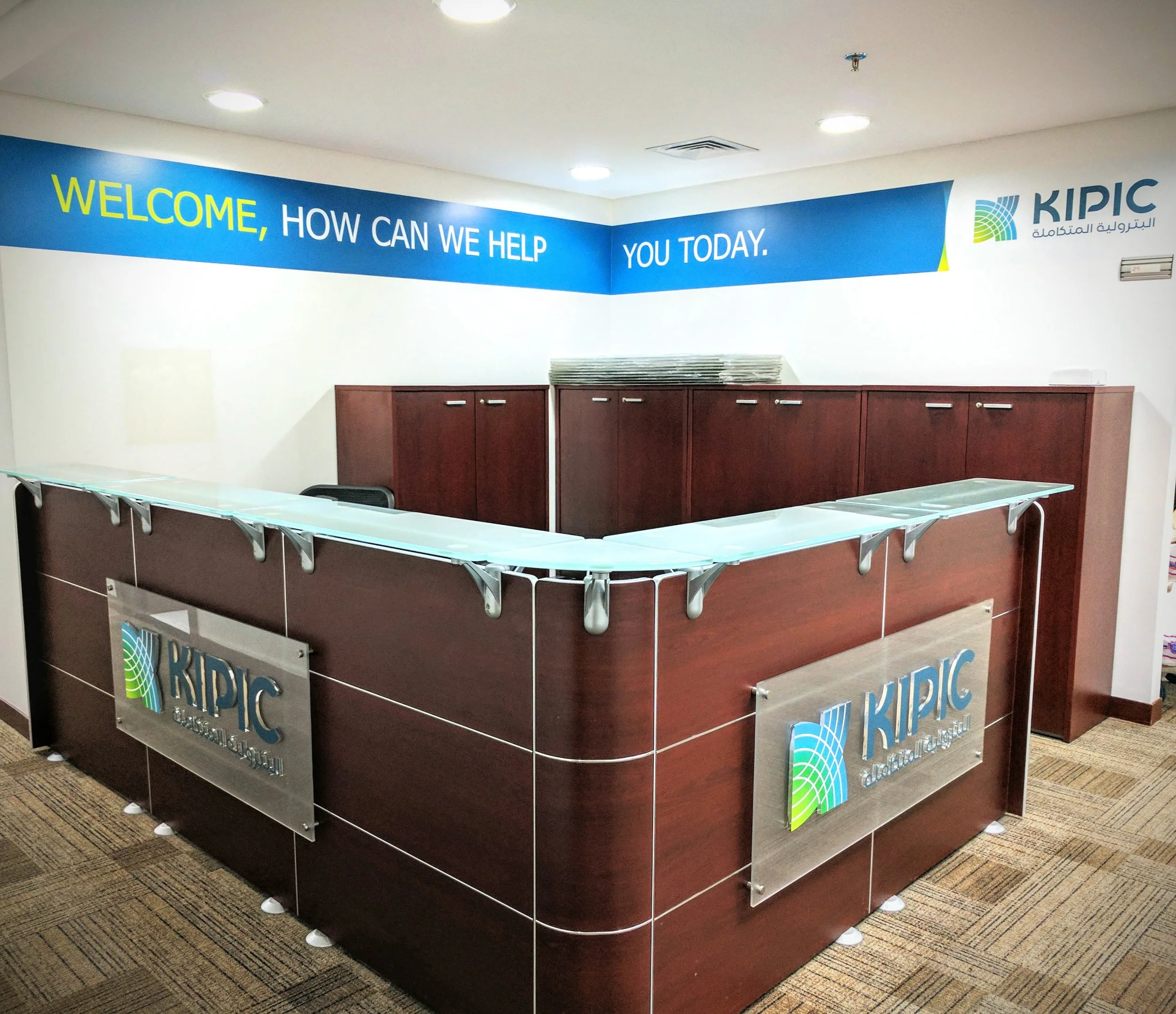
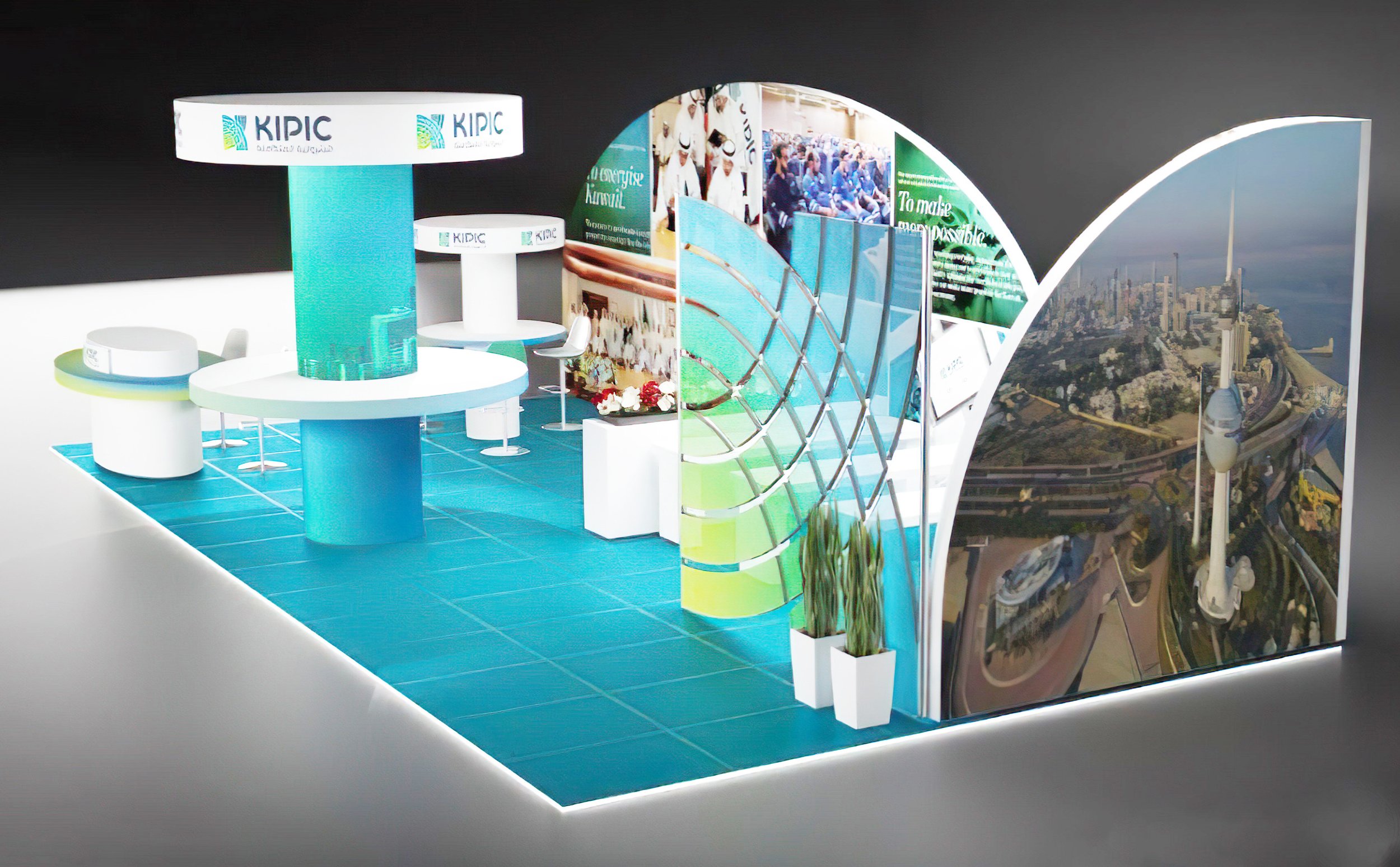
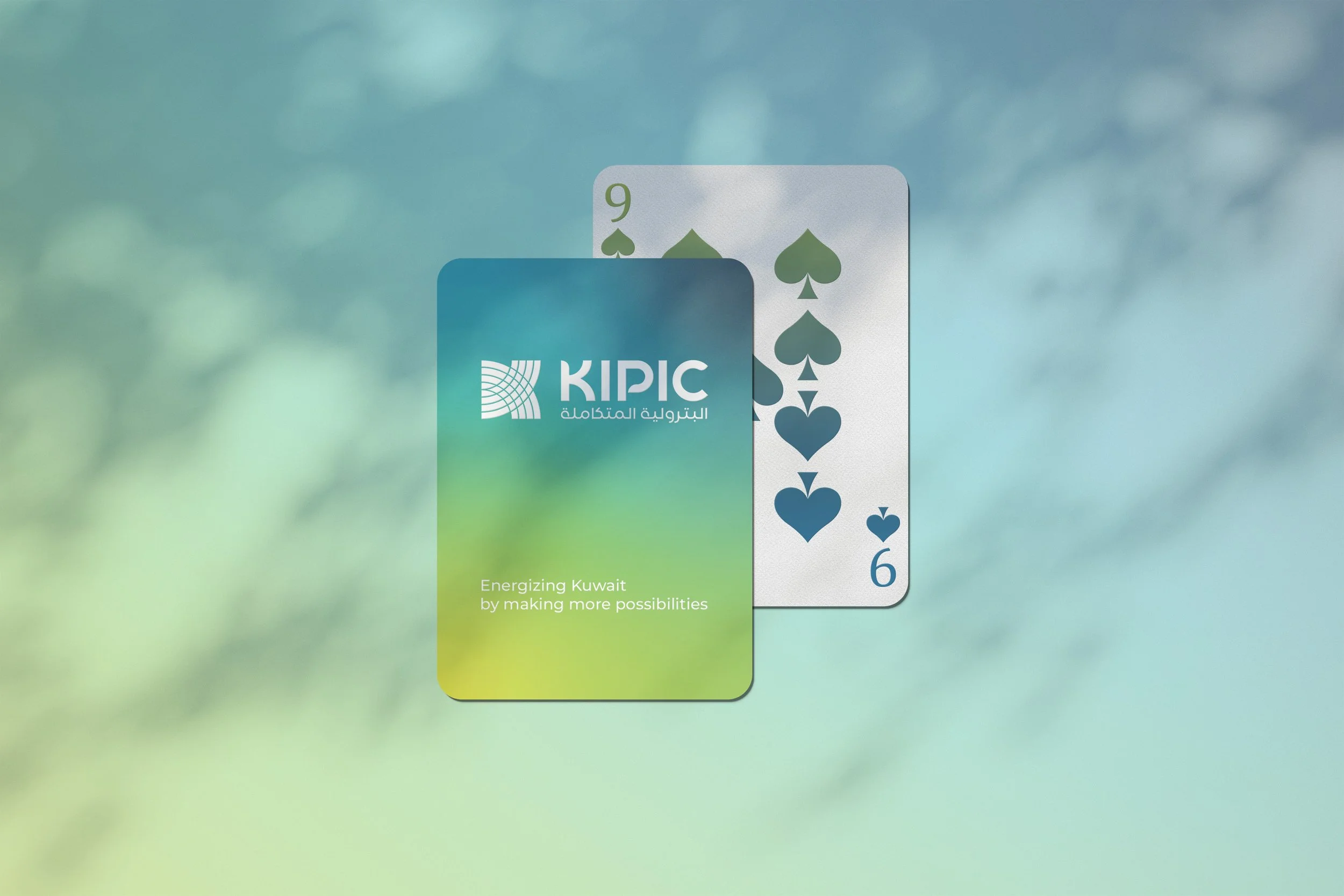
We built KIPIC’s identity from the ground up, starting with the logo and developing a complete visual system that defines how the brand looks and feels across every touchpoint. From corporate stationery and publications to environmental branding and office interiors, every detail was designed to create a cohesive, modern presence that reflects the company’s ambition and scale.
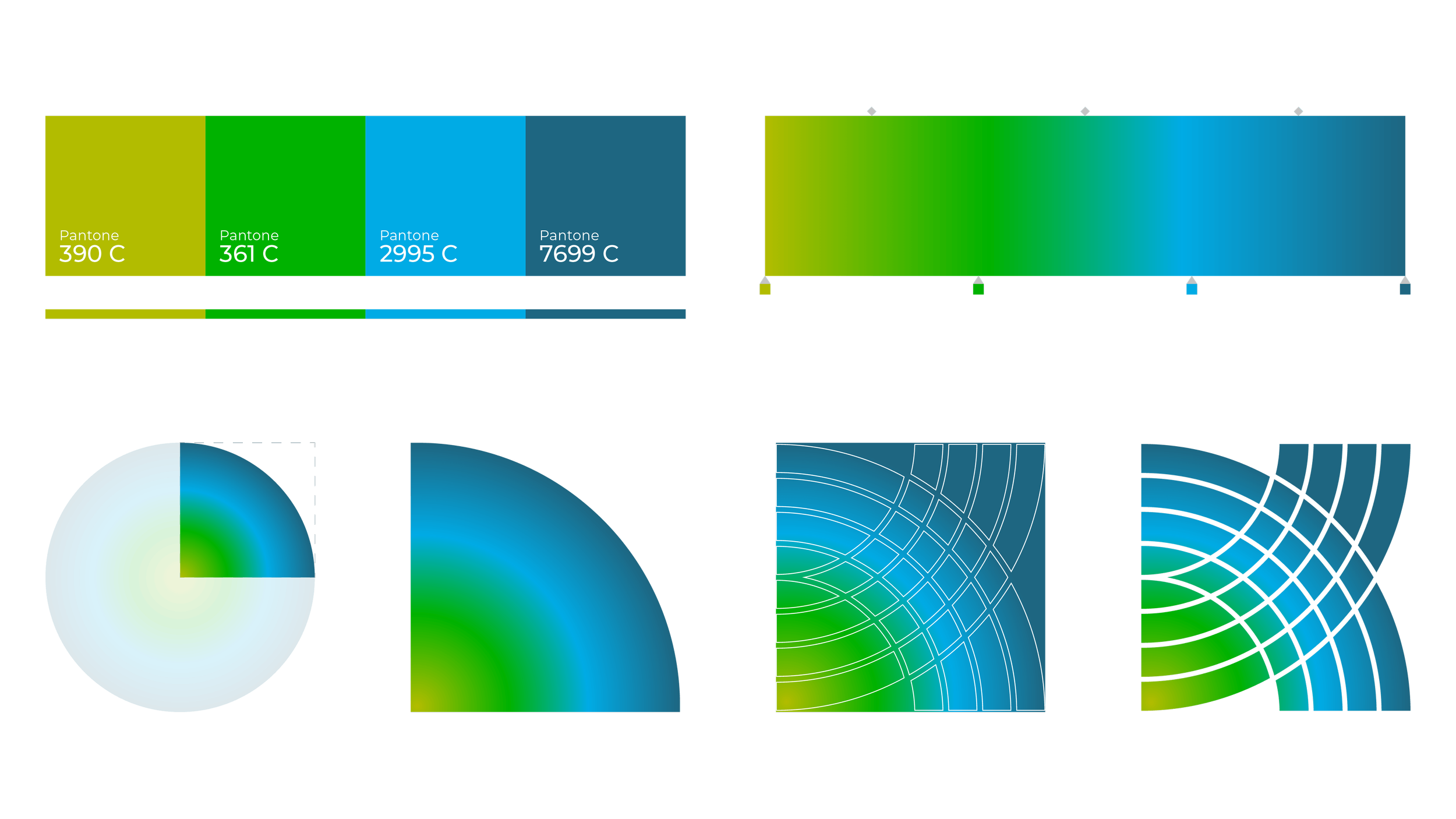
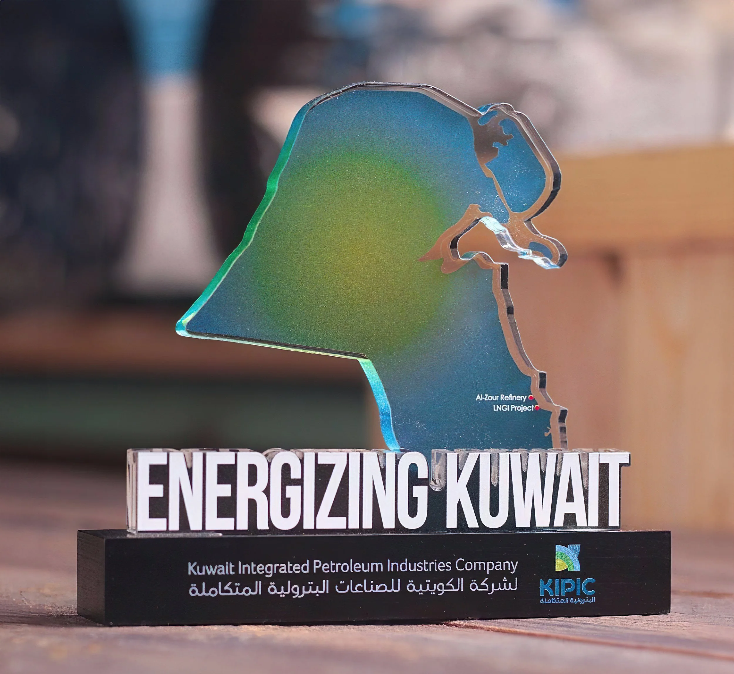
This logo is designed to create momentum and growth for KIPIC and Kuwait. The inspiration and rationale behind the stylized “K” graphic is integration and growth, it also represents Kuwait. The various woven, overlapping and intersecting graphic lines represent KIPIC’s integration of the petroleum industry.
It also represents the knock on ripple effect of which will help diversify the economy, secure the Kuwaiti domestic energy needs and provide growth for the private sector. The logo uses a clean, strong, contemporary logotype for both English and Arabic. This underpins and reinforces the solidity of the company and it’s commitment to Kuwait. The combination of colors in the logo represent (from light green to navy blue) the concepts of optimism, growth, environmental, openness, ambition, confidence and security.
The Logo
Brand Development
Executions & Implementations
2016, Kuwait